What a long strange trip it’s been…

25 09 2008
Woman of the Inner See

This wall hanging is obviously still a work-in-progress, but I think it’s far enough along for people to start to get the gist of where I’m going.  I kind of needed a little encouragement to keep going at this point, too. *sheepish grin* 

 
I have a machine but have learned that I far prefer to do all my stitching by hand.  Textile work is MUCH slower than any type of artwork I’ve ever done before, even papier mache. 
 
This work is made up of -as you can likely tell – discarded clothing.  I make no attempt to hide that fact, leaving hems, buttons, and pockets in place.  I’m open to suggestions of what to stuff into the pockets when the piece is finished! 
 
When it’s finished you will be able to tell (hopefully) that it is an abstract underwater theme.  The next fabric addition of tattered green chenille looks much like seaweed or algae-type stuff.   
This red fabric ‘peeking out’ through the re-purposed skirt takes the place of the Inner See’s “coral”, with the skirts pinned back with faux pearls to  reveal the “coral reef” and the strange ‘see creatures’ floating about the piece.  (They were fun to make!)
In general, the piece is a metaphor rising to mind from the title of a book: Woman of the Inner Sea, an intriguing title and a very intriguing book set in Australia.  I highly recommend it.  It also springs from lines in a grateful dead tune: Sometimes the lights are shining on me / other times I can barely see / reminding me / what a long strange trip it’s been (please don’t shoot me if I got them slightly mixed right now it’s late and I’m zonked)
These ‘see creatures” are simply black airbrush paint painted onto unbleached linen with a basic brush.  I then cut out the shape with a generous margin and ironed it onto some double-sided heat n’ bond that was cut to fit exactly the shape of the eye minus the unpainted margin.  When the bonded fabric had cooled I picked at the excess (unbonded) part of the fabric around the eye until all the threads were raggedy and loose and then bonded that piece directly onto the wall hanging.  Fun stuff! 
The other ‘see vegetation’ you see is made of sisal (the stalk), twine, and beads.  The entire piece was inspired by a sketch I made one afternoon.  I have never before attempted to translate any of my sketches into another medium.  Hmmm.  So far it’s been great fun. 
Steph


TMTA, Another Watercolour ATC

17 09 2008

Here is another watercolour ATC which I did for TMTA.  This week’s prompt is ‘handwritten’.


Watercolour ATC

10 09 2008

This is an ATC I painted for the latest promt ‘Dancing’ at Think Monday, Think ATC which is listed on the sidebar to the right.

I don’t know why this image popped into my head, it’s a bit weird, but at least I’m painting!

Thanks for looking

Stacey-Ann


Image transfers using acrylic mediums

5 09 2008

A couple of days ago, I received a lovely email from Jocelyn who had purchased a tub of acrylic medium from me a number of months ago. I had briefly explained the photo transfer technique that I so love using in my artwork that is by no means a “samm” original. She wrote to me in the hope that I could remind her of the technique so rather than type her a long winded, wordy explanation, I thought I’d photograph the process and post it as a bit of a “lesson” for others to share too. This is the first time I have done such a thing and i only hope that it is useful to you all. Please remember that this is my take on someone else’s discovery so there are probably other ways of achieving the same result.

I have numerous books on my shelf that outline this same technique, one of the most comprehensive being this one. If you feel like the real thing, visit Misty at http://www.mistymawn.typepad.com to see where she’s holding her next workshop and you might want to ask her which one’s will incorporate the technique or, you could drop me a line, if you’re in Australia, and ask me when I’m next holding my technique class…. enough promotion and on to the good stuff!

Photo transfers using acrylic paint medium

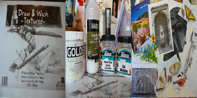
from left to right, the products I used for this “lesson”

210gm paper – these pads are an Art Spectrum product, available at most fine art supply shops (here in Victoria anyway). I used this paper today only because I am having a bit of a love affair with the pads at the moment. The paper is sized to cope with both dry and wet media and therefore can handle a little bit of abuse. I would normally use a heavier weight watercolour paper – 300gm and 100% cotton is the best and this technique also translates well to fabric. You have to have a bit of a play around to find what you like and what will suit the project you are doing.

Acrylic mediums – I am not faithful to a single product, I unashamedly admit this! I find that each product has it’s strengths and weaknesses and I like to play around to get the best for the particular project on the day. Photographed are Golden’s soft gel (thank you dear Misty), Liquitex Gloss varnish and medium and both the Gel medium and Polymer Gloss Varnish by Matisse. For this example I used the Liquitex product – It dries quickest and gives a nice “thin” finish.

Images for transferring – You can transfer many different types of images. Black and white toner copies, both b&w and colour laser copies, inkjet images and some magazine photos (the cheaper the paper, the better the transfer). Try anything! I have been known to say that this is not a “perfect” process and that the resulting image will not be a clean and perfect mirror image of the original – I have had one person prove me wrong though, so by all means, manipulate the technique to suit yourself.

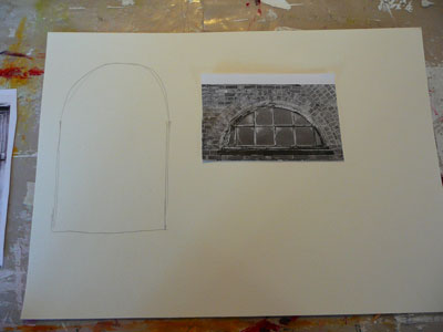
Depending on your ideas for the final piece, you may or may not want to prepare your surface a bit for the image transfer. I had an idea for a painting so I roughly sketched an outline of the larger window that I would add to after transferring the original photo. The image I have chosen for this example is a b&w laser copy of an original photo. (Be conscious of copyright issues here. Make sure to chose images which are copyright free or use your own photos or scanned artwork).

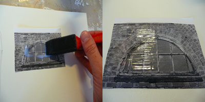
I add the medium with anything that’s nearby, including my fingers! Today there was a foam brush handy!!! The photo on the right shows that the medium is added and you can still see the image underneath. When you use a gel medium, the medium will appear a little more cloudy. You ultimately want to provide a “sticking” surface.

Place the coated image face down on your receiving surface and rub so that all of the image makes contact with the paper/fabric underneath.

I make sure I leave an edge or corner free so that I always have something to pull away when the time comes.

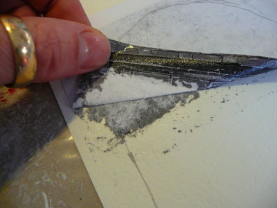
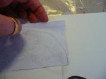
After a little while, and unfortunately I can’t be more specific than that as drying time will vary depending on many many factors (weather, product used, image type, paper type etc), slowly start to peel back a corner or edge and you’ll see the top surface of the image paper separating from the image itself. If this doesn’t happen, place the paper back and keep rubbing with your finger. The photo above shows you what you’re looking for…

Once you have removed the top layer of paper, it is important to then leave the transfer to dry completely before removing the rest of the paper. Speed the process up with a hairdryer if neccessary, you’ll end up with holes in the image if you try too soon!

The image is now dry enough for you to rub and rub and rub until all the little bits of paper are gone! Sometimes you may not be able to remove them all, accept and embrace them! I use my finger, a stippling brush with a bit of water works really well too.

holes of impatience!!!

The finished transfer – ready to be altered to your heart’s desire!

The following photos are some transfers that I’ve done as examples for my workshop attendees.

colour laser copy on calico

to prove that straight lines are possible (if you want them!!)

colour laser copy on 300gm watercolour paper

And just a reminder that things can get a bit out of control if it’s always all about me…..

Samm

http://www.sammiam.wordpress.com


SJJ – Photocopy collage

16 08 2008

For this two page spread we were instructed to photocopy at least three of our journal spreads and pick out our favourite bits to re-use here.   I knew which bits I wanted to use in the main, but decided to use all of the photocopied pages.  I tore out the images I wanted to keep whole, the stencil figure, the face and the tree and glued them in place.  I then ripped up the rest into smallish pieces which I glued to the pages, sanded and then painted with a yellow wash which came out green – I did this a couple of times to get some depth to the colour.  I added the quote, which comes from a traditional women’s circle song, in between the washes.  I am happy with the finished effect.

Left:

Right:

In case you cannot see it the quote reads:

“Be careful what you lean on

It may not hold you up

Or lean freely

And be prepared to make an art of falling”

Jill

http://meanderingmuse.wordpress.com


Soul Journal: My House pages

13 08 2008

This is our blue `beach house’ sitting on top of a mountain miles away from the sea. The other page shows our local clock tower and shops in the high street. Like Jill, I wasn’t keen on making paper dolls – my family is HUGE and I couldn’t contemplate leaving anyone out, so I left the journal lying open and went off in search of coffee and inspiration.

When I got back, my 2-year-old grandson Jei had decided to add his own interpretation to the pages. Laughing at his joyful, energetic swirls and squiggles, I grabbed green and blue crayons and joined in. And that’s where we left it, Jei and I, for these pages now express everything I feel about my home and my family. The joy of creating bubbles like laughter from one generation to the next, and its so good to share my life with them.


SJJ – pot pourri collage

11 08 2008

The above is the name given to the technique for these spreads by Sarah.  On each of three days we were given a list of various things to do on our pages.  We were then to cut up each of these lists and pick at random the order in which we would work them on a particular day and spread.  I have enjoyed working/playing this way and I now realise that I can use these techniques for work that I have wanted to do for a long time but was reluctant to do in an in-your-face downright obvious way.  Now that I am getting to grips with the layering techniques I feel I can embark on the personal projects that have been gathering much dust in my mind.

Days 16, 17 and 18:

Jill

http://meanderingmuse.wordpress.com


SJJ – House

10 08 2008

The next spread in the Soul Journal Journey was to create our house in a child like style – enjoyed that loads even though it falls off the bottom of the page.  The right hand side is of the flats on the other side of the green and behind the trees, which is the view from my window.  I am lucky to live where I do – almshouses which are listed buildings within a beautifully green oasis in the middle of the inner city.  A young friend visiting from Spain on her return home reported that,  “Jill lives in a park!”

We were then to collage making a pocket on the main body of the house.  As I am playing catch-up I could see what the next step was to be and this was to make paper dolls which represented our family – an interpretation of that was fine.   I am thinking to do family/relationships spreads later on perhaps – but I really didn’t want to do paper dolls.  Not meaning to offend anyone, each to their own and all that,  but it was just too cute for me – I cannot do cute.  So being who I am I did my house and surrounds but no folks.

My house actually does look like the sort a child would draw, a friend described it as looking like a fairytale house.  Here is my spread before and after collage:


Pages 3,4,5 and 6

4 08 2008

Pages 2 and 3: squares

This spread is all about layering. We were given a list of 27 images to find and put on our pages in any order we chose, previously having coloured the pages with a dark colour.   Returning to this after pages 4 and 5 we were instructed to draw squares etc around pics of our choice and to spread on and wipe off a pale colour.  I did this and ended up with a basically pink page which I really didn’t like at all – hated in fact.  The pictures sank into the page and it just looked awful to my eyes.  I know the point of this is not to make pretty pages, but it is about getting to know ourselves – and I definitely did not like what I had acheived so I decided to go over it with, firstly oil pastels and then paints of various dark hues.  I am much happier with this now and will leave it alone until I decide to fiddle some more :).

Pages 3 and 4: “I forgot to tell you….”

The pages were gesso’d first of all to prep them.  Next the instruction was to write in a stream-of-consciousness style filling both pages, starting with the prompt: “I forgot to tell you…”.   Well, I was surprised at what came out of this for me, it was really quite cathartic, as is often the case when writing in this way.  It ended up as an almost letter to my mother who died earlier this year, many of the things I never got to say.  I knew the next step for this spread was going to be to cover the whole thing up and I really wrestled with this as I felt that what had come out in the writing was important for me and I did not want to suppress it again.  So I left it for a day or so until I came to a firm decision about what I wanted to do:  leave the writing totally uncovered as was my initial emotional response, or follow the instructions and see what happened.   As you can see I opted for the latter, however I did copy the text before doing so – so yeah it was a bit of a cop-out but I am happy with that.  Next it was tape, all sorts anywhere, then gesso, then sanding that lot, then paint.  I like the effect of this and am happy that I am getting to do the sort of backgrounds, many layered, that I have wanted to achieve.

Jill

http://meanderingmuse.wordpress.com


Soul Journal Pages 1 and 2

30 07 2008

I started thisproject a few days late but never mind.

I’ve never been one for starting my journals at page 1 and continuing until I reach the end. I’ve always opened them at any page and just carried on working in that way, a page here and a page there. This has already taught me something new, working in sequence can have benefits! The claiming my book exercise at the start of the book got me straight over that sinking, daunting feeling of a blank book. I’ve done similar exercises before but somewhere in the middle of the book!

The armour exercise was an interesting one for me, ignoring the martial aspects of the armour, I saw it as building a protective shell around what I think the most important part of being creative is… a brave heart.

Page 3 and 4, I was limited by the magazines I had on hand, so I probbly spent way too much time being picky about the pictures, collecting and saving them in order. So much so I missed the word “art”, and I seem to have ended with a very blue page rather by chance than design. I will be going back to the spread to add more drawing.

I’m not sure about the dolls, and if I’ll make those, we’ll see.